In the late 1960s and early 1970s, intrepid racers from a fledgling carmaker quickly earned respect by besting much larger and more experienced manufacturers, like Porsche and Ford, on the international rally circuit. That company was Alpine, and their signature model was the fiercely handsome A110 Berlinette, with its distinctive grille-less face and striking silhouette. In 2017, Alpine awakes from two decades of slumber, and pays homage to their heritage with a new production car – the Vision – and a completely refreshed marque. The visual identity for this relaunch is powered by custom typefaces and lettering from Production Type.
The comprehensive typographic solution involves three aspects: a revised ‘A’ emblem and ‘Alpine’ wordmark, a type program for automobile badges, and a complete typeface family for use in all Alpine communication and marketing. Production Type’s brief was driven by the crisp aerodynamics and muscular performance of Alpine cars, both past and present. The resulting typography evokes the qualities that made the marque famous: speed, agility, and excitement.
Charting Alpine’s new typographic roadmap, from logo to custom fonts.
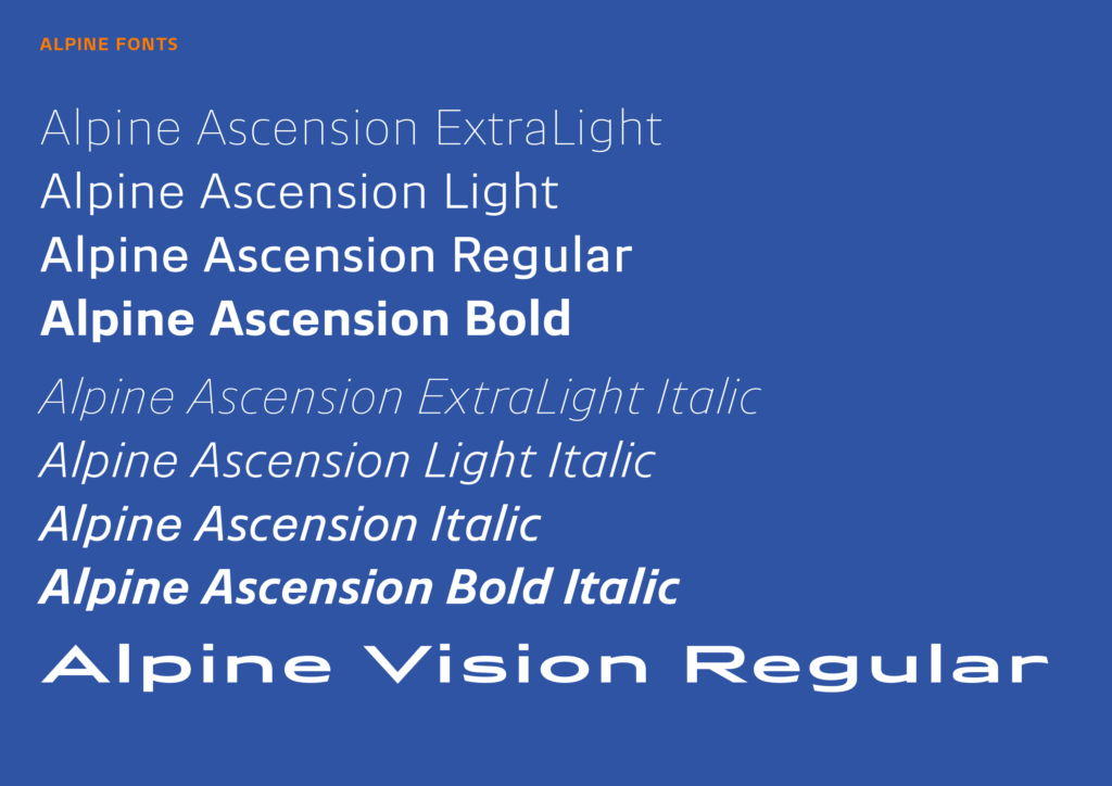
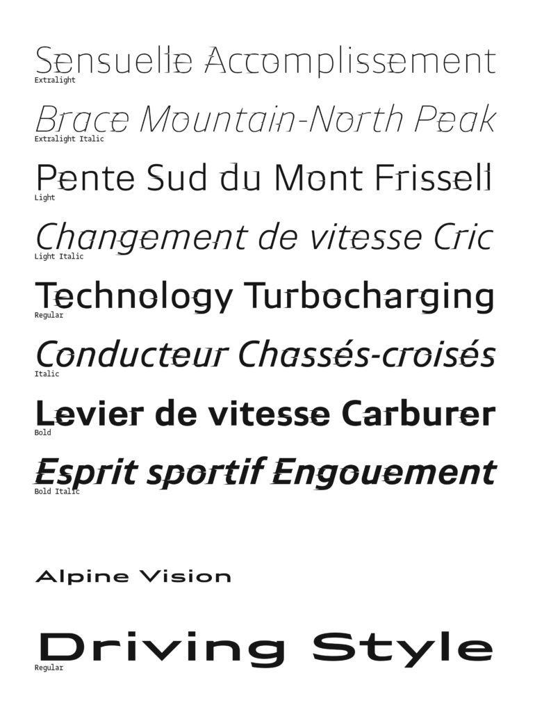
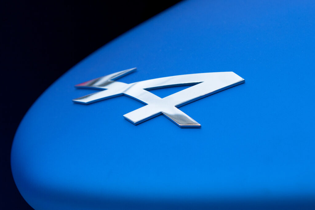
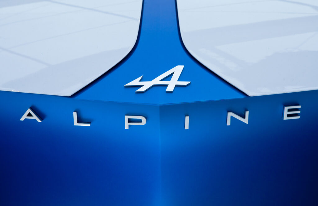
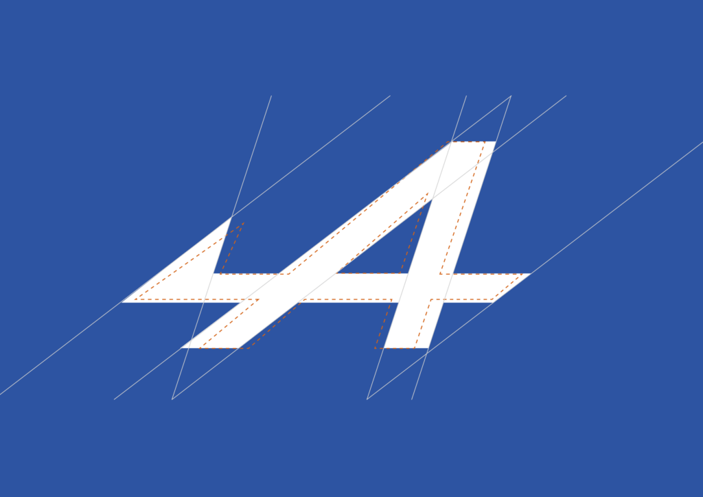
At the starting line was a redrawing of Alpine’s existing logo. Production Type improved the ‘A’ by reducing the length and prominence of its piercing arrow, and harmonizing its angles. After reviewing several new proposals for the wordmark, Alpine settled on a subtle refinement of the existing lettershapes. The wide sans serif, with its mix of pointed apexes and angled terminals, is now more balanced and cohesive. A new typeface, Alpine Vision, extends the wordmark style to a complete font with an extensive character set.
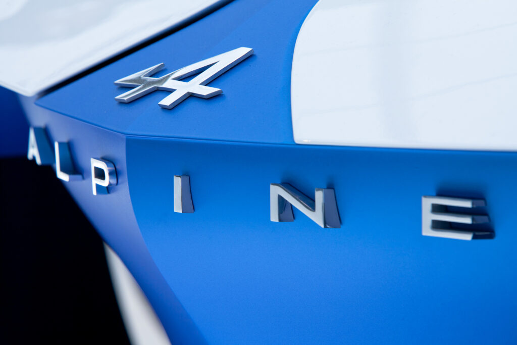
The cars’ exterior badges got a new look, too. Production Type drew sleek numbers that are in tune with the rest of the typographic redesign, while fitting each set precisely within the surface dimensions specified by Alpine.
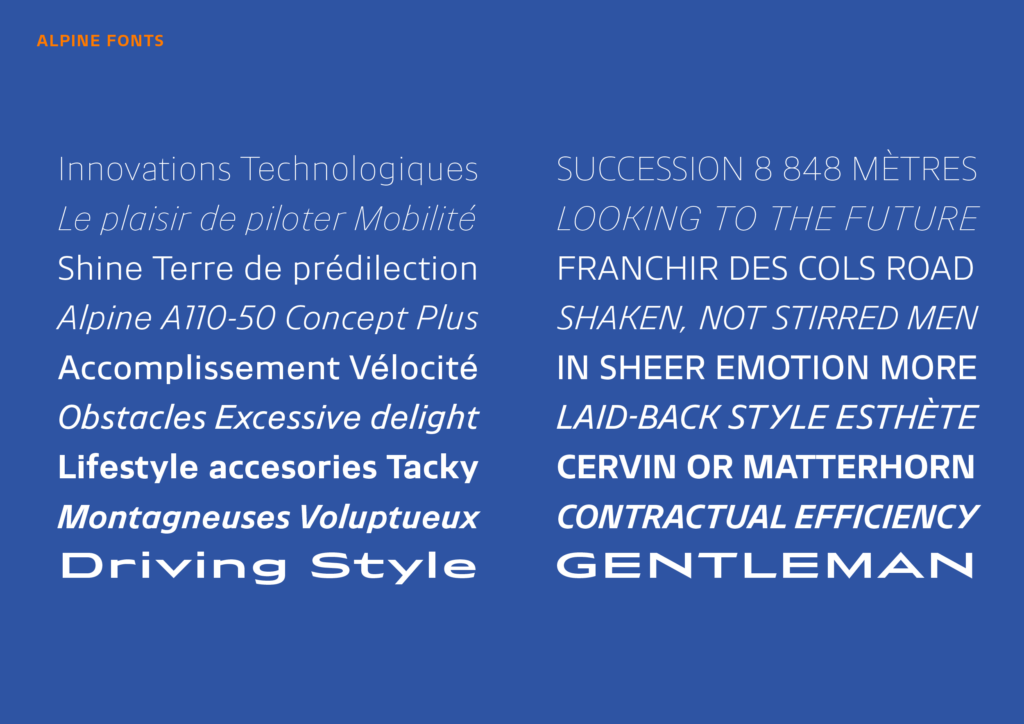
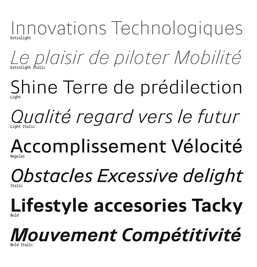
Wrapping up the course was Alpine Ascension, the company’s new typeface family for all branding, marketing, and communication. Like the automotive legacy it represents, Ascension is a design that mixes a lightness and clarity with strength and style. The sans serif borrows formal concepts from multiple categories: the toughness of Grotesks, the openness of Humanists, and the rugged, legible shapes found in the Gothics of roadside signage. Squared forms (a, e, o) ride alongside smooth and open curves (c, g, s, t). High shoulders (h, m, n, r) contribute to an engineered look. These aspects, along with relatively short descenders, yield compact, space-efficient type – a reflection of the car itself, which is notable for its lean size and weight. As a whole, the type steers clear of the boxy, overtly technical look that is so common in other carmakers, and stays true to the French heritage of the Alpine brand. With 17 styles, the Ascension family offers all the flexibility Alpine needs to promote the new brand in print advertising, broadcast spots, and on screens – for websites and in-car displays.
(source and content courtesy of Production Type)
